
First look: the new MultiPortal design system
A preview of the new MultiPortal design system: one layout for every resource page, and status colours that keep their meaning when customers apply their own branding.
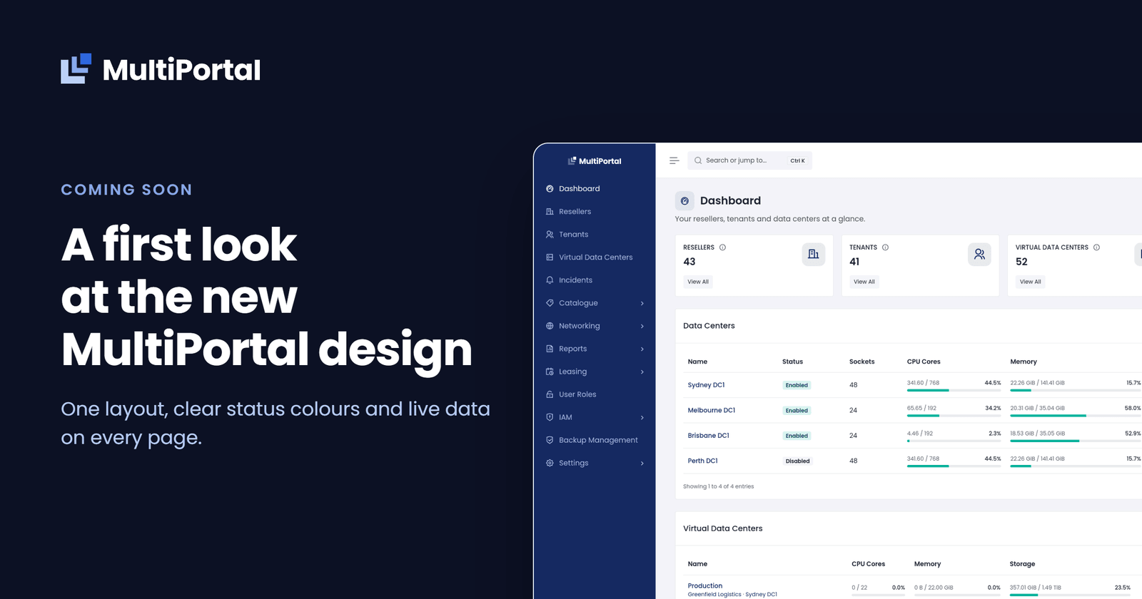
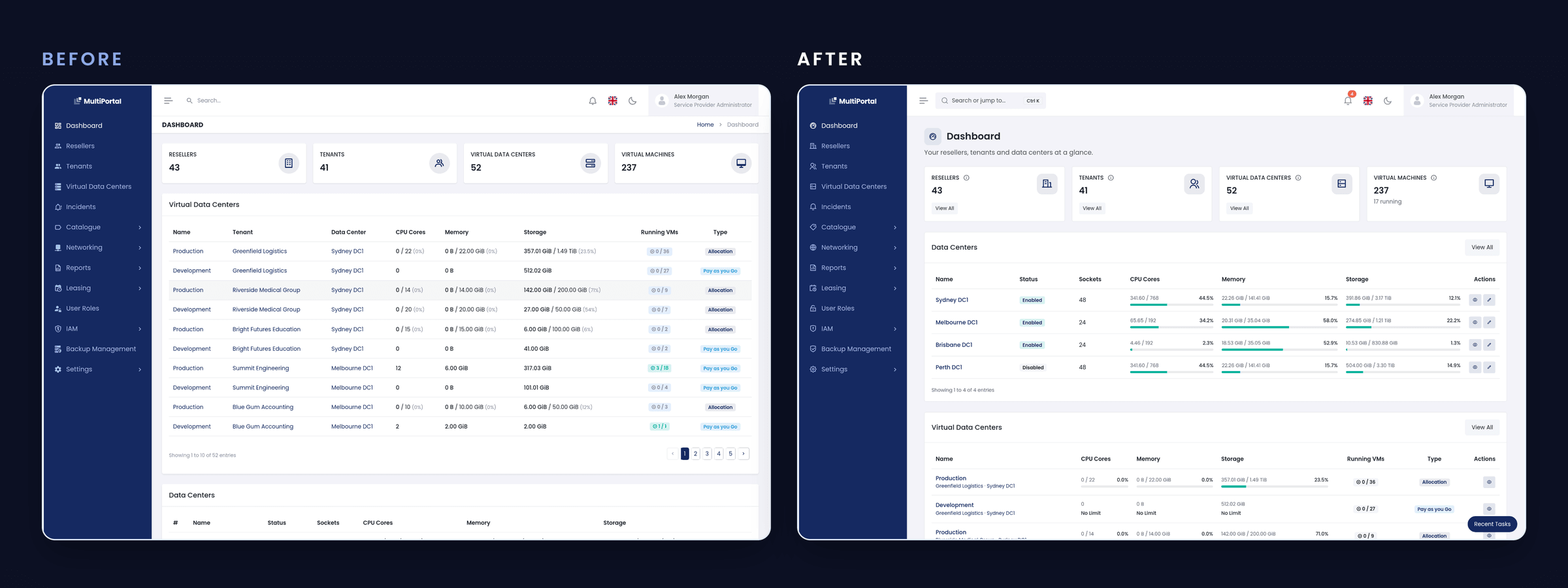
Consistency is an important part of a good user experience, and it is the focus of the new design system we’ve been building for the MultiPortal platform. For service providers managing resellers, that means less time spent searching for controls and data. Pages will share one layout, buttons will sit in predictable places and status colours will carry the same meaning on every screen.
The benefits extend to your customers, too. Even when they apply their own branding, status colours will retain their meaning, ensuring a consistent and easy-to-understand experience across the platform.
Built one feature at a time
MultiPortal grew over several years and each new screen followed the conventions in place when it was built. Over time, pages ended up with different structures and there were no shared rules for details, such as button and icon sizes.
Our answer is one design system that every page will follow.
Inside the redesign
One structure for every resource page
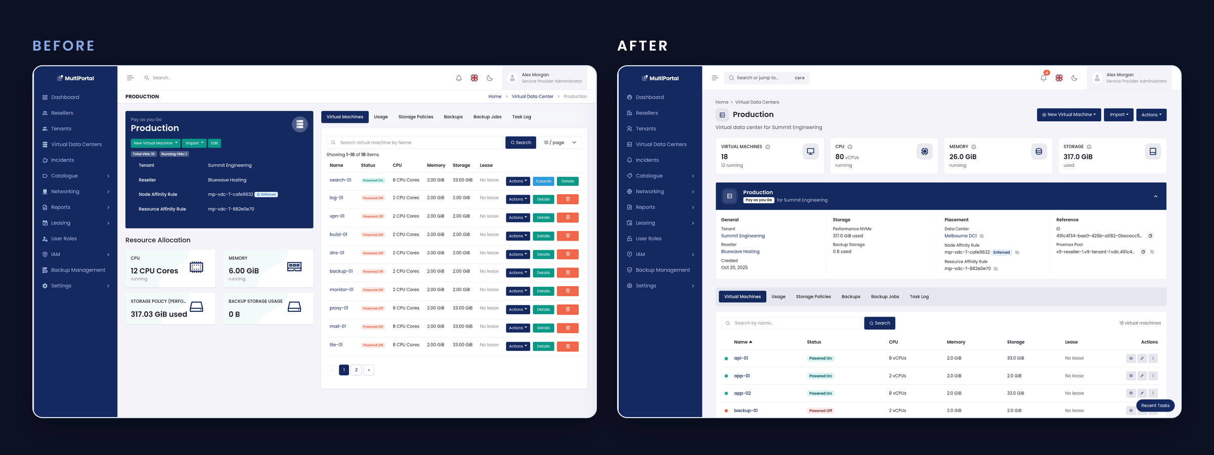
Pages for an individual resource, such as a virtual machine or a reseller, will follow the same order:
- The header shows the name and status, with the main actions always at the top right.
- Key numbers show the few figures that matter most at a glance.
- A summary groups the resource’s details under a few clear headings.
- Tabs keep everything else one click away.
- Lists offer search, a result count and the same row actions everywhere.
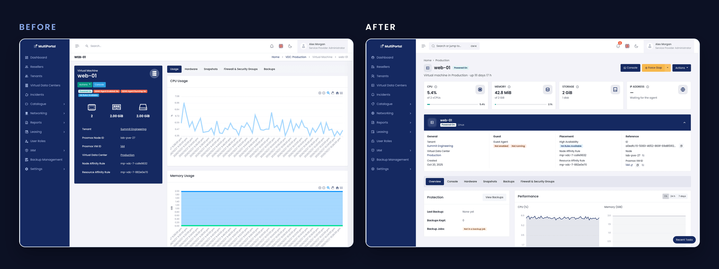
Because every resource page follows this order, what you learn on one page applies to the rest. You can move from a reseller to a virtual machine without relearning the screen, and anyone new to MultiPortal has one layout to get familiar with.
Branding that leaves status colours alone
Today, buttons and status labels share the same colours, so Save, Cancel and Stopped can look almost identical. When a customer applies their own brand colours, those colours replace the ones MultiPortal uses everywhere.
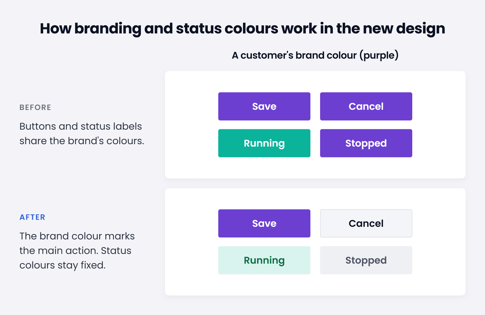
The new design keeps the brand colour for each page’s main action and gives status its own fixed set of colours that branding can’t override. Green, amber, red and grey will mean the same thing in every customer’s portal. Existing brand settings will also carry over automatically, so neither you nor your customers need to reconfigure anything.
Your features stay put
The redesign is visual and structural only. Every feature remains and works as it does today, including virtual machine console actions.
Release timing
Our team is still polishing the new design system, and while we’re hoping to make it for our upcoming 1.3 release, we want to make sure we get it right, so this may be pushed to our 1.4 release. We’ll share more previews here and in the forums as we get closer to the release.
Have questions before then? Get in touch with our team.